Websites
We specialise in delivering custom ecommerce website design and development tailored to your needs.
Online experiences should feel seamless no matter the user or device.
Sell more online
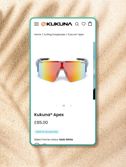
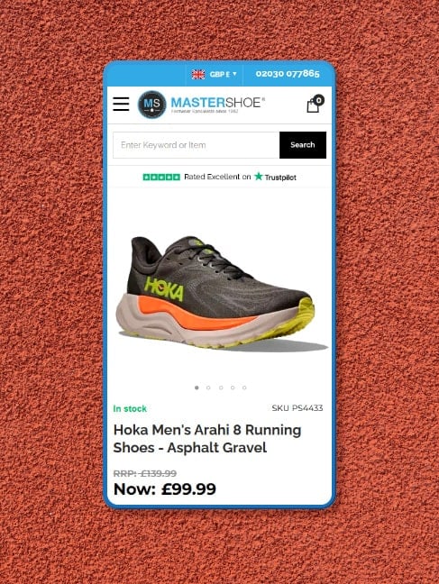
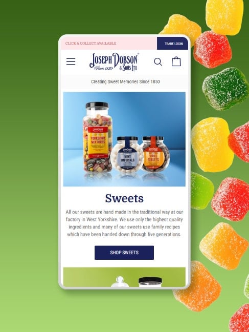
Ecommerce Stores
Affordable web stores built on leading platforms, designed and developed bespoke to your requirements. Our award-winning studio is qualified to handle across Magento, Shopify, BigCommerce and more.

Certified
developers

User friendly
navigation

Responsive
design


Trade sites made simple
B2B Stores
Relying on an outdated wholesale site for larger sales? Create seamless experiences between trade and retail with B2B stores – build with tried and tested design principles for the best convertibility.

Bulk
ordering

Tiered or
custom pricing

Advanced
search
Ecommerce success stories


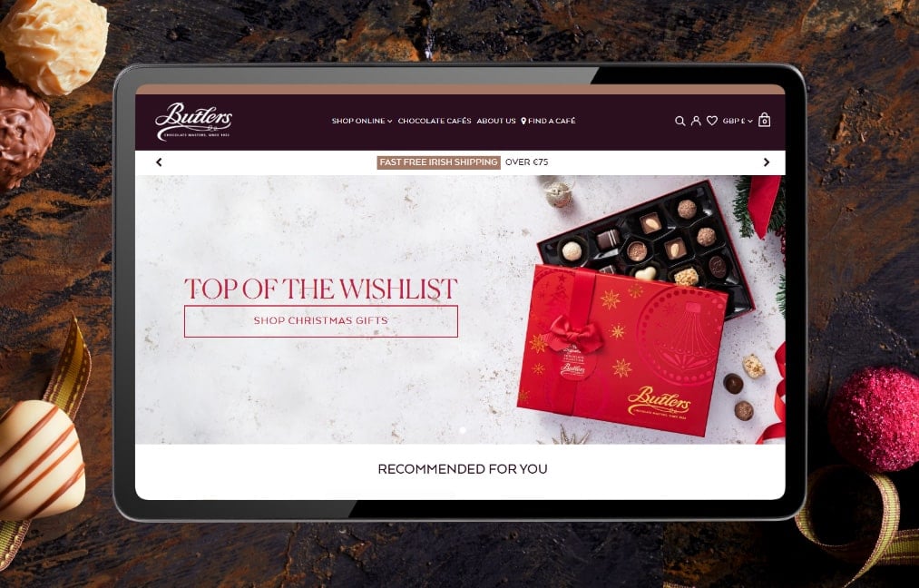
Since 2004, we’ve delivered over 1500 web projects for businesses looking to sell more online across B2B and B2C.
Helping Ecommerce businesses across all industries


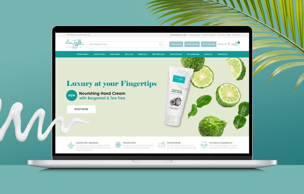
Present your best self online
Business Websites
Showcase your services with contemporary design responsive to your all devices. Whether you’re launching a startup, need a website refresh, or seeking to dominate the market, we cater to every phase of business growth.

Bespoke
solutions

Universal
branding

SEO
enriched
